Spectrogram of a Penderecki Composition
Posted Feb 20, 2017
Tags: music, signal processing
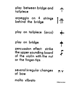
Krzysztof Penderecki is a polish contemporary composer known for his unconventional treatment of orchestral music. He frequently makes use of extended instrumental techniques that break free from general pitch-time paradigm to employ a variety of other ways of making songs. These included moves such as kicking the body of a cello with heels, or bowing beyond the bridge to let out a shrill howl.
On first listen, it is easy to conclude that a lot of Penderecki’s music sounds like noise. This is especially interesting, because his career as a composer began post-WWII, a period when communication and the idea of noise were at their most nascent stages. Much has been written about his interest in the sound-making electronic devices that were born out of the war, and the various artificial effects they brought along, such as harmonic distortion and filtering.
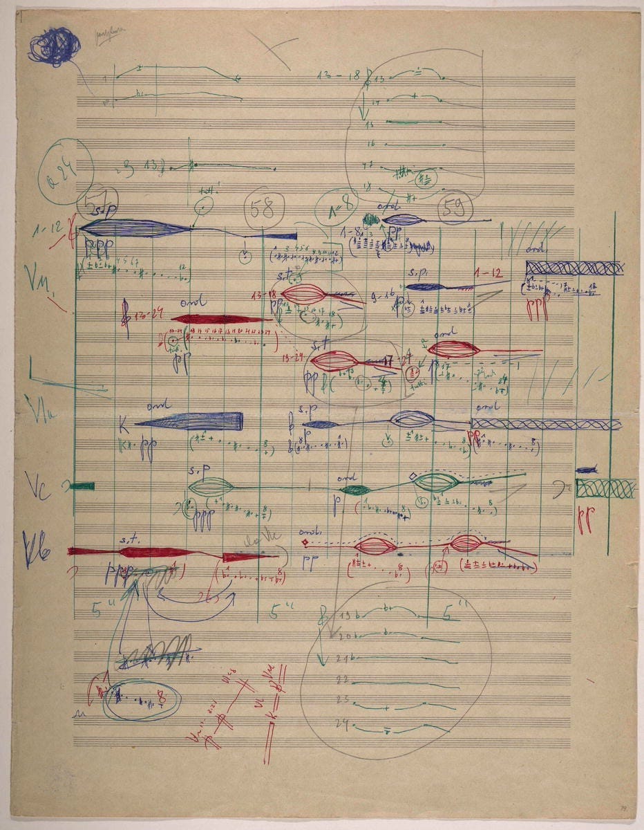
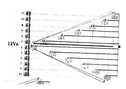
In order to document the new kind of affordances that he explored for an orchestra, Penderecki had to invent his own graphic form of music notation. This notation often drew from machinic representation of signals and other times, other visual natural phenomena. Here is a picture of his WIP score for Polymorphia, one of his better known works that was inspired by the EEG of a patient.
There is an interview of Jonny Greenwood where he describes what he believes is Penderecki’s motivation behind composing the way he does, which nerd-sniped into analyzing it like I have described below.
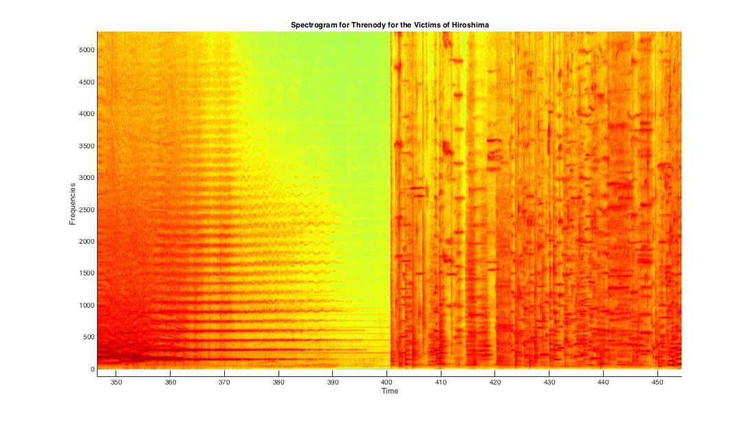
So I found a recording of his most famous work, Threnody to the Victims of Hiroshima, performed by the Polish Radio National Symphony Orchestra (you can listen to it on YouTube.) I pulled it into MATLAB and did the most rudimentary operation I could ever do with an audio file: I made a spectrogram out of it.
Here is an image of the spectrogram.
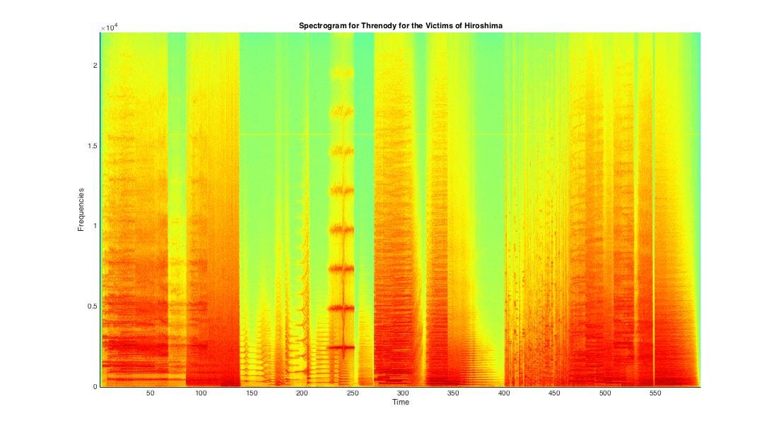
Yes I took the time to label the axes. But Time is in seconds, and Frequency in Hertz. Oops.
The spectrogram is a chart that gives you a reasonable picture of what frequencies are present at what point in time during the audio. The composition lasts for about 10 minutes, or 600 seconds. The image here gives away that Threnody… has various sections. Notice that there are blocks of red regions with quite clearly defined starts and ends, making it easy to discern between noisy and quieter parts.
In a spectrogram, horizontal lines mean that there are steady tones (probably sustained on a violin) played for extended period of time, while vertical lines mean there are transient sounds. If you plotted an audio with just drums in it, you will see a lot of vertical lines. If you plotted a violin playing D# for a whole minute, it will be a constant group of horizontal lines extending across. Any piece of music has these two things: Notes changing with time and sustaining for various short periods, and Transients appearing now and then to add rhythm — a play between horizontal and vertical lines, so to speak. Right?
Here’s the spectrogram for Threnody… zoomed in.
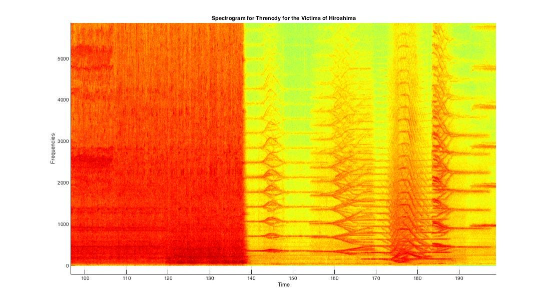
There are lots of sustained notes in harmony as we can see from the general presence of horizontal lines. But look at the divergences and convergences! The divergence in the second picture almost looks like a nerve ending. In the audio, a little past the 3rd minute(~190 seconds), multiple instruments simultaneously glide off unison, up and down in frequencies, creating an odd warping effect — allowing a singular tone to expand into a block of sound, or a tone cluster.
The second picture also shows some very pronounced dark horizontal patches around its middle. It you listened to the track scrubbed in to ~4 minutes (240 seconds), you will hear that this is a bunch of violins sustaining a shrill tone with a very well-defined start and end. The plot betrays the intensity here.
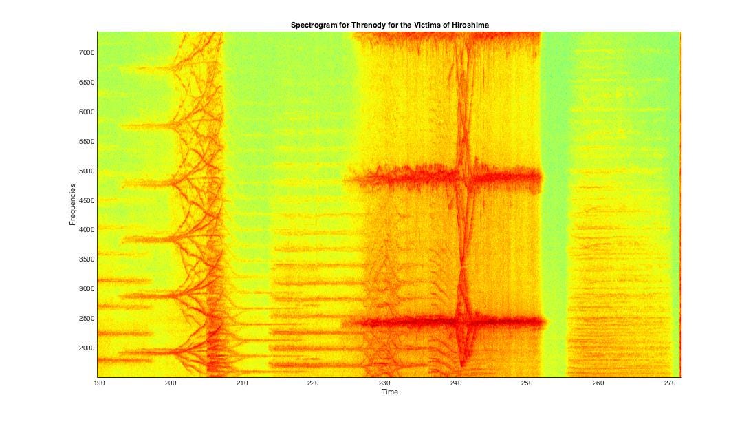
That was section 2 of the track. Here is a later section with more transients.
See how sustained lines begin to begin to fade out, but in the form of a vibrato, after which a section of vertical lines start? This region(to the right) also contains red blotches of horizontal lines, which correspond to violinists plucking their strings to create sharp, but tonal sounds that die quickly. Listening to it is helpful.
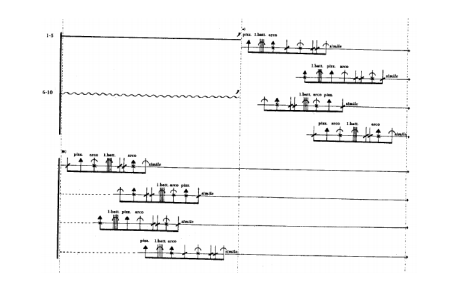
Here are a few images from the score of Threnody… that instruct tone divergences as well as the various kind of transient sounds that need to be produced. Now is also a good time to scroll back up and take another look at the WIP Polymorphia score.
All images sourced from this thesis here. That document is everything this post needs to be.
Spectrograms are always a great way to look at a piece of audio and understand how it changes from time to time. In the field of Music Information Retrieval, a spectrogram is an obvious thing to do — I would dare call it the ‘hello world’ of that field. However, never has a simple mathematical trick such as the spectrogram managed to give away this kind of detail about the music. And never has it corresponded so very well with the original score written by the composer in a quiet room.
It is very tempting to believe that Penderecki was fully aware of the kind of output a spectrogram would give for his music — so much so that it looks like he used that piece of information to paint on the canvas of a spectrogram **using the medium of sound.
It’s compositions like these, which remind you that whatever you are looking at really means something in the real world. It reminds you that beneath all the abstractions is a work of art with its beauty preserved beyond the torturous routine of chopping it into pieces and applying a Fast Fourier Transform.
That’s because a score and a spectrogram are essentially the same thing — both show what frequencies come up at what time.
Previous
← Fan Chirp Transform